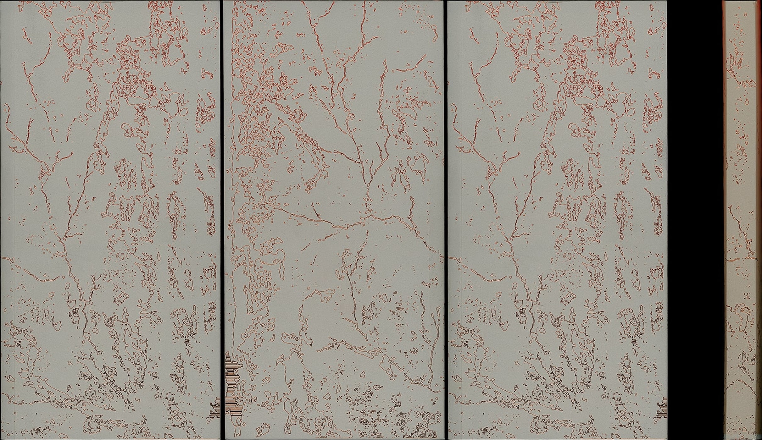
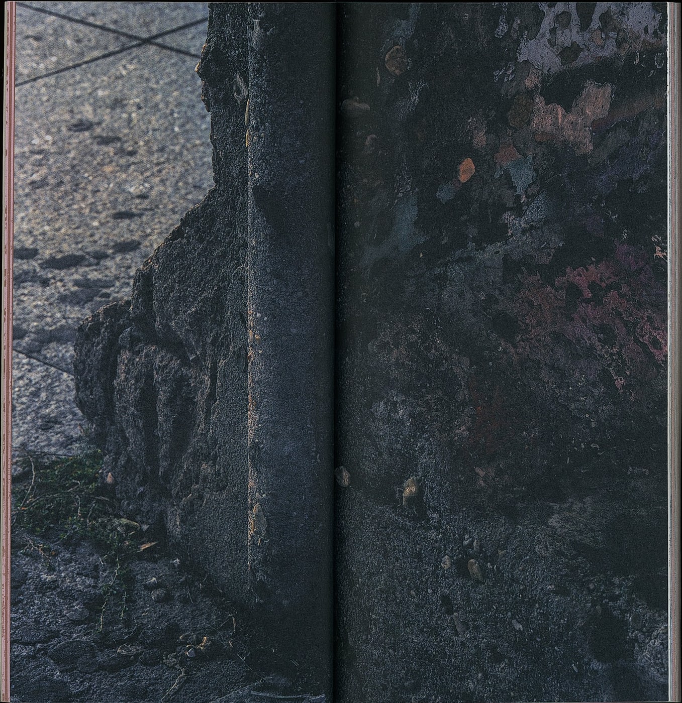
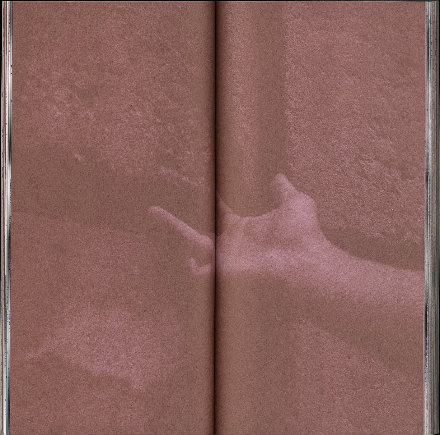
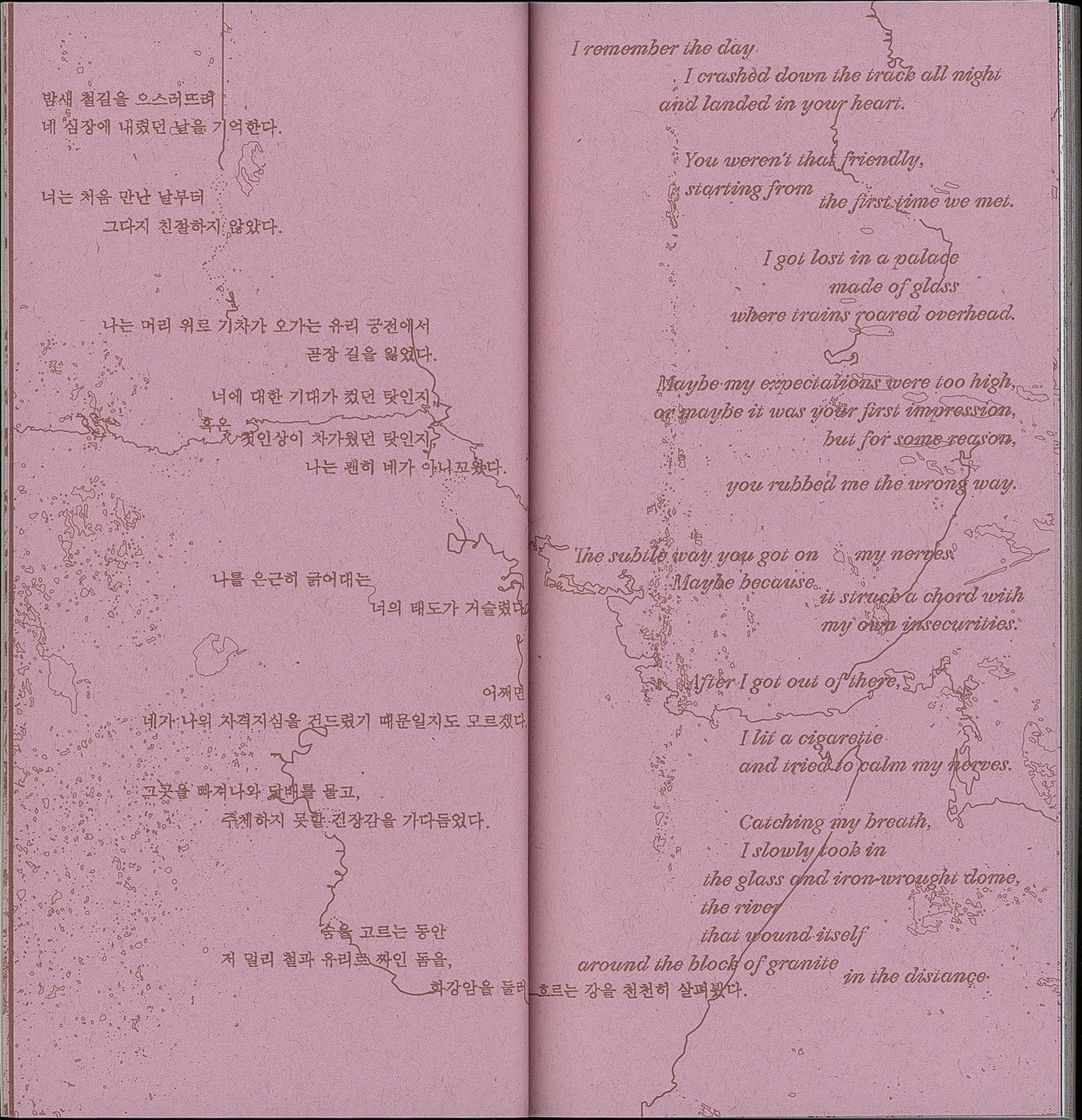
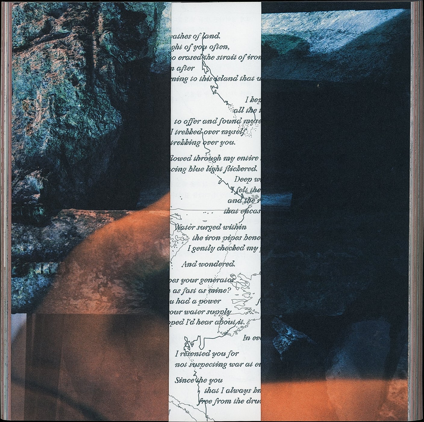
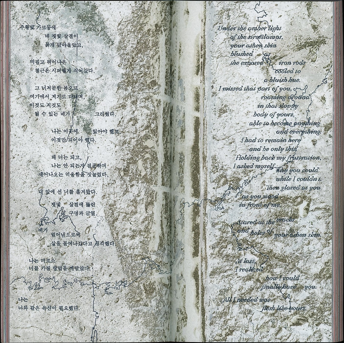
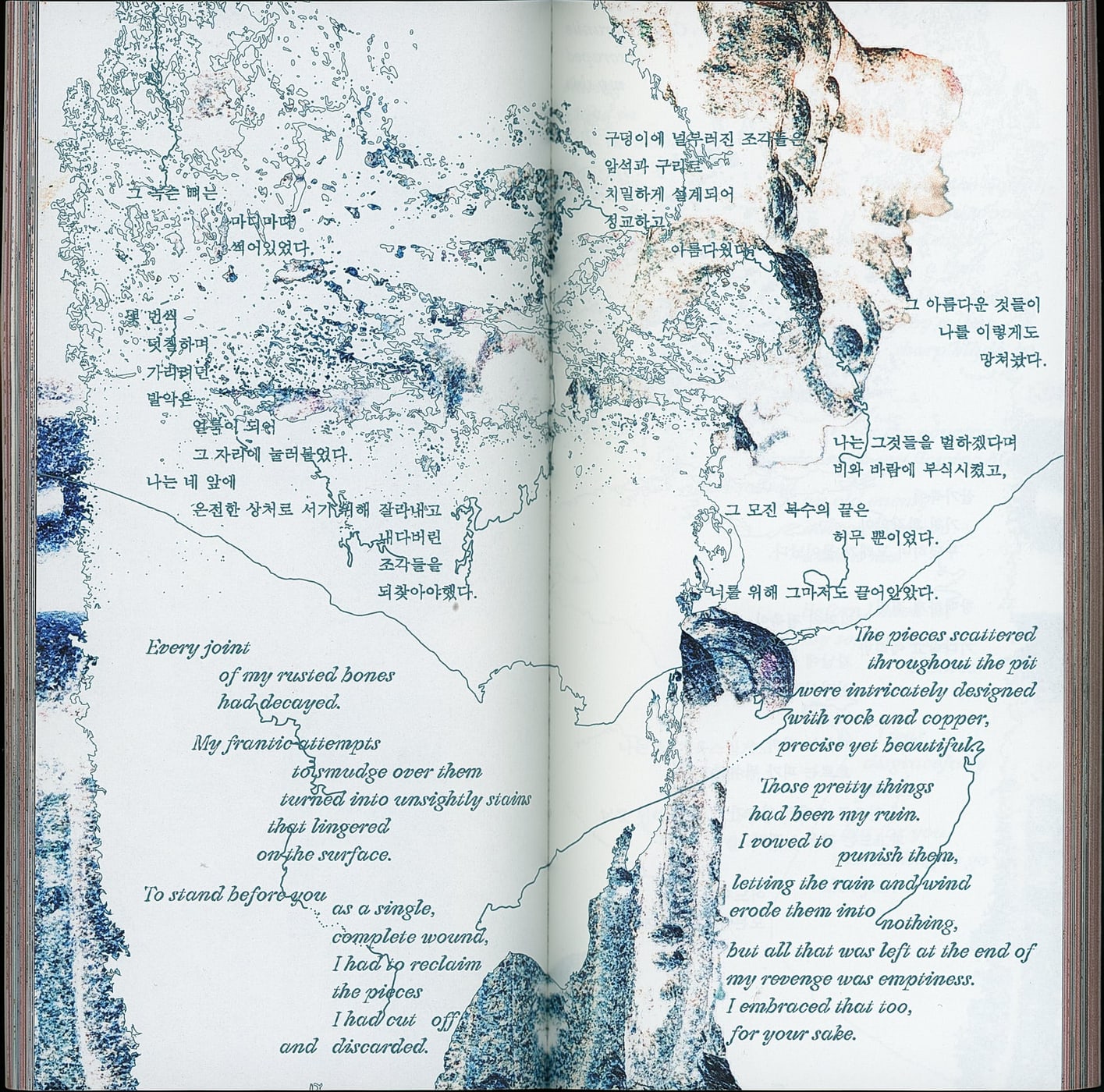
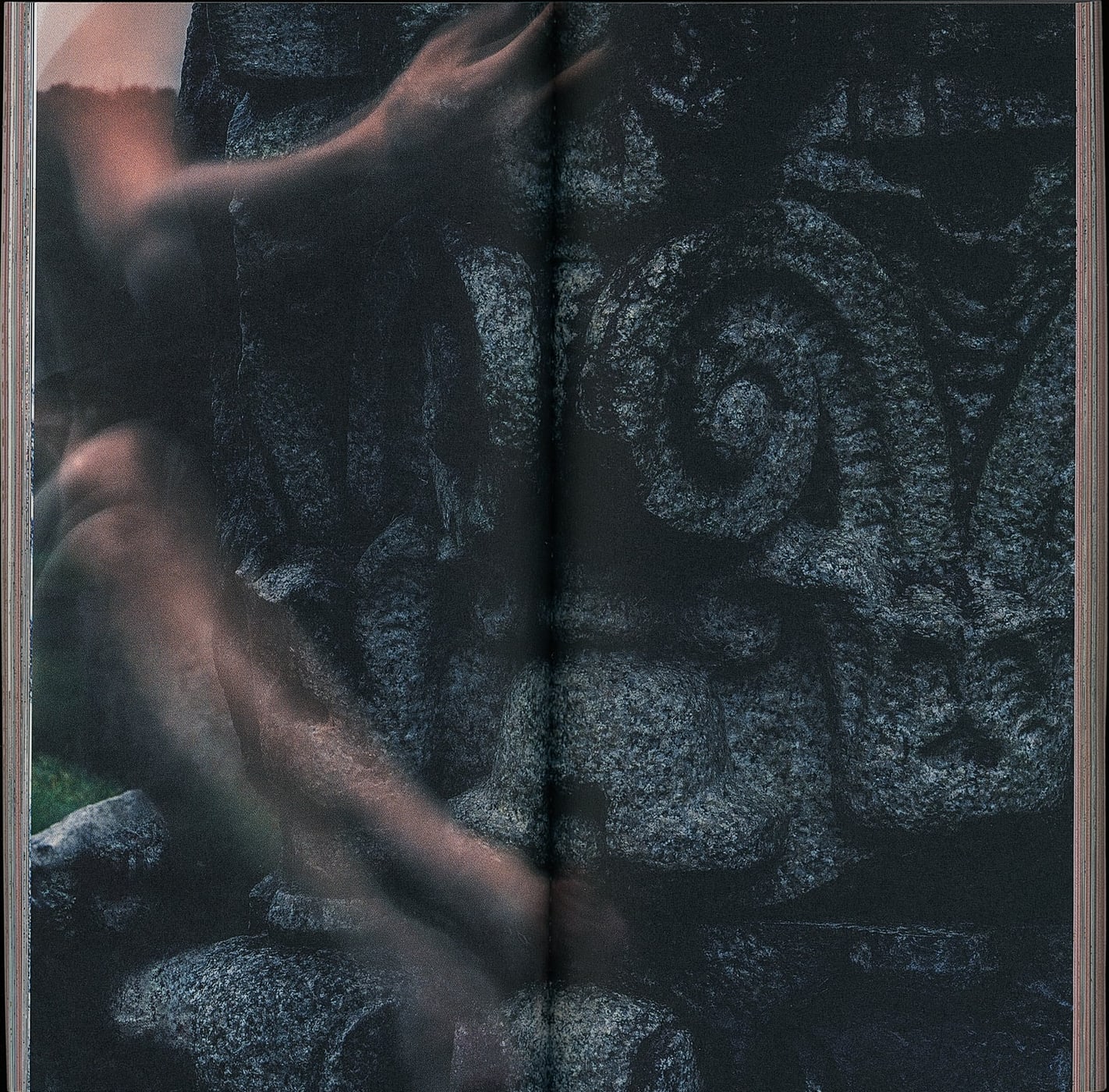
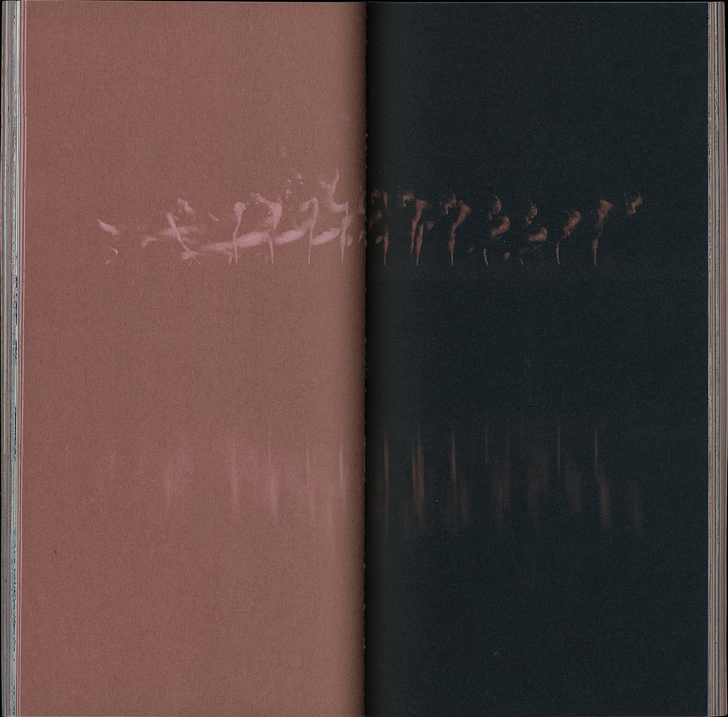
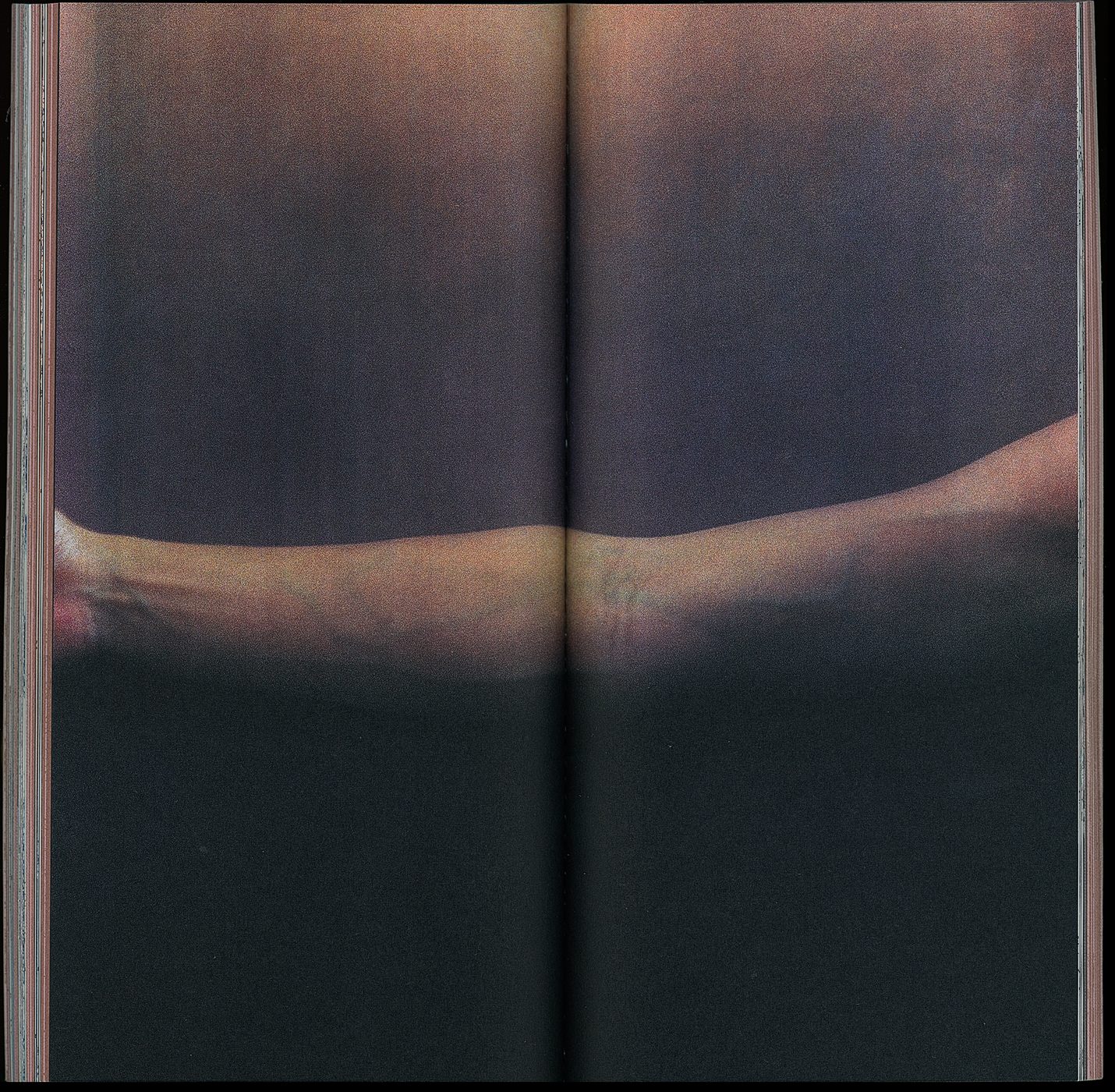
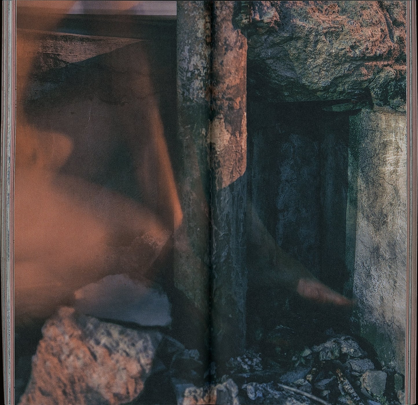
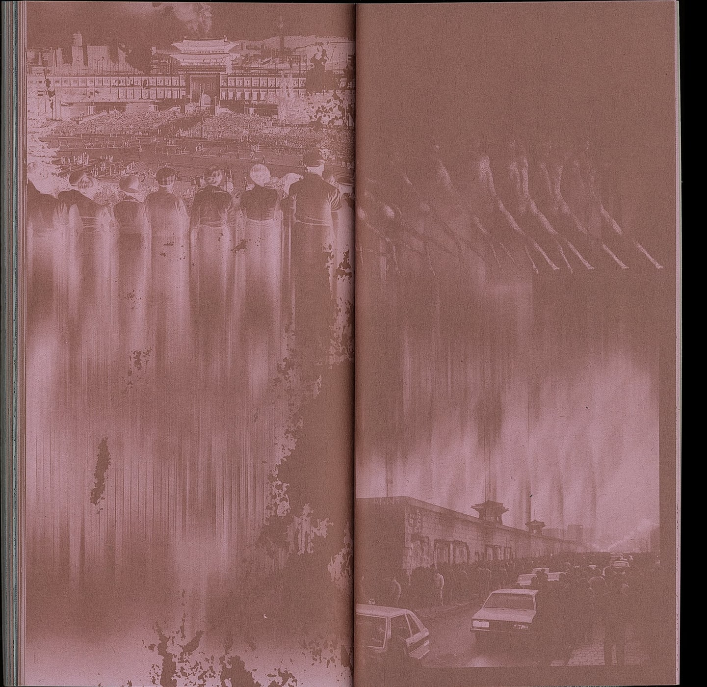
The book was designed and made as part of an installation. The text block uses two papers: a white woodfree stock that carries the photographs, and a newsprint-like comic paper carrying images made from black-and-white or video frames, printed in a copper spot colour. Pages of fragmented text cut into the photographs like a barrier, which is why PUR binding was chosen — so the book opens flat. The cover reproduces the feel of touching a concrete wall, and the linear forms of the copper-foil drawing made by hand on the installation are stamped into it. As the books line up like a wall, front and back covers alternate, and the pattern continues without a break.
책은 설치 미술 개체의 일부로 설계되고 제작되었다. 내지는 두 종류의 종이로, 사진을 보여주는 백색 모조지와 흑백 또는 영상 프레임으로 만든 이미지는 동색 금속 별색을 만화용지(갱지)에 올린 두 종류를 사용한다. 본문이 파편화된 페이지들은 사진을 장벽처럼 가르고 들어가며, 이는 PUR 제본으로 펼침을 확보한 이유다. 표지는 콘크리트 벽을 만지는 질감을 구현하고 설치 미술 개체에 손으로 그린 동박 드로잉과 같은 선형을 박으로 새겼다. 책은 장벽처럼 늘어서는 구조에 따라 표지가 앞뒤로 교차할 때에 끊임없는 패턴으로 이어진다.